Here’s a gallery proving that designer table lamps are the perfect way to bring a splash of colour into your interior scheme…
Many of the brilliant interior designers we talk to stress the benefits of being bold with colour – using strong contrasts and bright hues to make a statement in a room. And you don’t have to paint a wall pink or reupholster your sofa in electric blue to create a wow – a designer table lamp or a splendid lampshade is a perfect way to introduce a splash of colour to a scheme. But not everyone is as brave as Sarah Akwisombe or Siobhan Hayles when it comes to deliberate mismatches and glorious clashes of yellows and greens and purples and oranges. Some of us need a bit of a nudge, or a confidence boost about our own judgement. So with that in mind, here’s a gallery of how other people, including some top designers, have used Pooky table lamps and lampshades for perfect pops of colour…
Bold but complementary
Just because an item complements your colour scheme, that doesn’t mean it has to be innocuous. A lamp in a bold shade of your main colour theme can be both striking and harmonious.
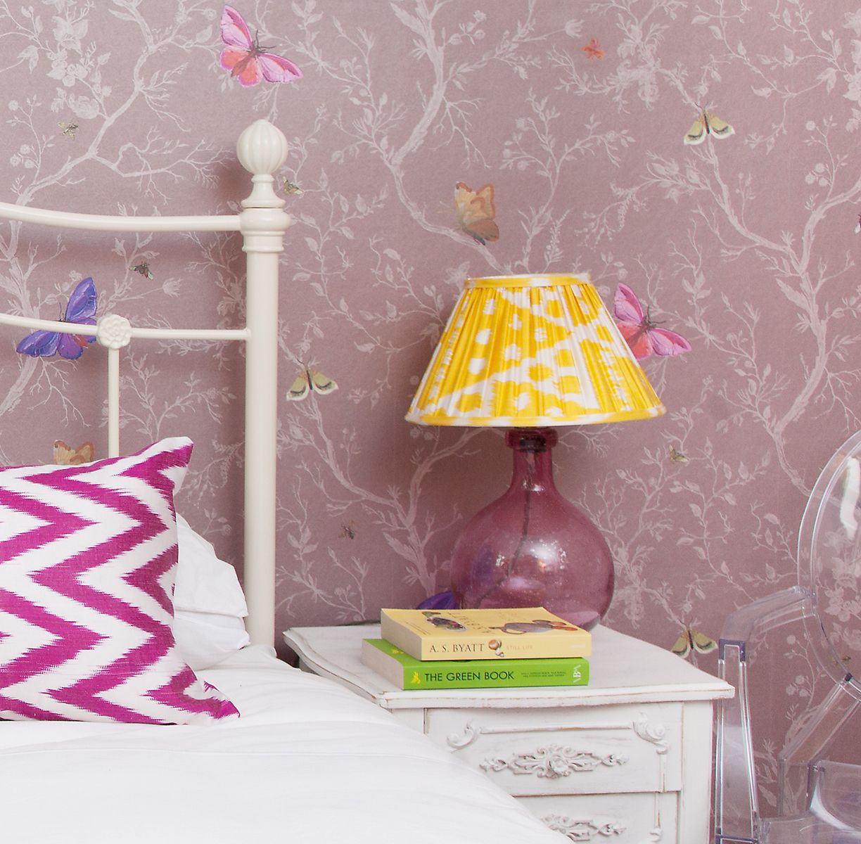
Photo credit: Susie Lowe
Above is an example from the home of the brilliant lifestyle journalist Emily Murray: our Elsa table lamp in magenta along with a yellow ikat shade working wonderfully with her own ‘Timorous Beasties’ wallpaper. (See our piece on Emily and her home here). And how about this room styled by the textile designer Bluebellgray? Our Lola lamp in emerald green is an inspired choice to go with the green and blue hues used in her own beautiful shade and fabric designs. - Unfortunately the Elsa and Lola table lamps are no longer available, but please take a look at our extensive range of table lamps here


Surprise pops of colour
Another way of using table lamps and shades for colour is to introduce a surprise element. We like how Anna Cox (purveyor of very nice Moroccan cushions) has matched one of our pink block printed cotton lampshades with her cushion design, in an otherwise neutral scheme:

But you can also have surprise colours even in non-neutral, busy schemes. This is a glorious room created by artist and designer Luke Edward Hall as part of the New British Style Project for House & Garden in association with Farrow & Ball.
That’s our Nellie ceramic table lamp adding a dash of the eye-popping yellow colour that we call ‘mootard’ to its extraordinary surroundings (check that marbled wallpaper!). A fine example of how you can use all sorts of improbable colours together to magical effect if you trust your instincts and your eye.
Black and white… and colour
If you have a black-and-white theme going on, even a subtle colour can work a treat, adding depth and contrast to the monochrome element. Here’s a very sylish hallway arrangement from designer Shanade McAllister-Fisher. That’s our Iris table lamp with a shade in black card. Note how the turquoise echoes the eye in the picture – very clever!

And conversely, if you have a lot of colour in your scheme, then a black-and-white lamp can do the job that a bold colour in a neutral scheme: providing a brilliant contrast. Here’s our Lottie styled as a bedside lamp by Rock My Style blog – proving that black and white can be remarkably colourful.

Image credit For more design inspiration, take a peek at these posts:
Pooky in the bedroom – designer bedside lamp inspiration!
Inspiration gallery: how people are using pooky table lamps in their homes