Our collaboration with Farrow & Ball lets you choose a table lamp in exactly the right colour for your room. But how do know which colour is the right one? Here are some tips for using table lamps for accent colour in your room...
Interior design and rules of three
Interior designers do love their ‘rules of three’. For some reason, again and again you find that in theories of interior aesthetics, three is the magic number. When you’re hanging pendant lights over a dining table, three is more aesthetically pleasing than two. When ‘dressing’ a side-table or sideboard there is a tried and trusted rule that a set of three objects nearly always works best. In lighting design, you achieve mood by balancing three kinds of light: ambient light (the general main light in a room), task light (for practical purposes like reading or cooking) and accent light (to highlight features). This is a process known as ‘layering’ (see our handy guide to layering light here). And funnily enough, something quite similar applies to colour...Colour theory: the 60-30-10 rule
The 60-30-10 rule is an easy rule-of-thumb to help you achieve balance and harmony in a room’s colour scheme, encompassing not just the paint on the walls but all the furnishings and fittings too. Quite simply, you select three colours, and use them in the room in those proportions. So 60% of the room will be made up of the main colour (very often a neutral) – perhaps your walls, ceiling and larger items of furniture such as a sofa. Your second colour will account for half as much as the first – so, 30% of the room’s overall appearance. Perhaps curtains, a single wall, a fireplace, painted furniture or a rug. Finally, the last 10% will be made up of your accent colour. Without an accent colour an interior can actually feel quite ‘flat’, so judicious use of a third colour can really bring a room to life.
Using table lamps for accent colour
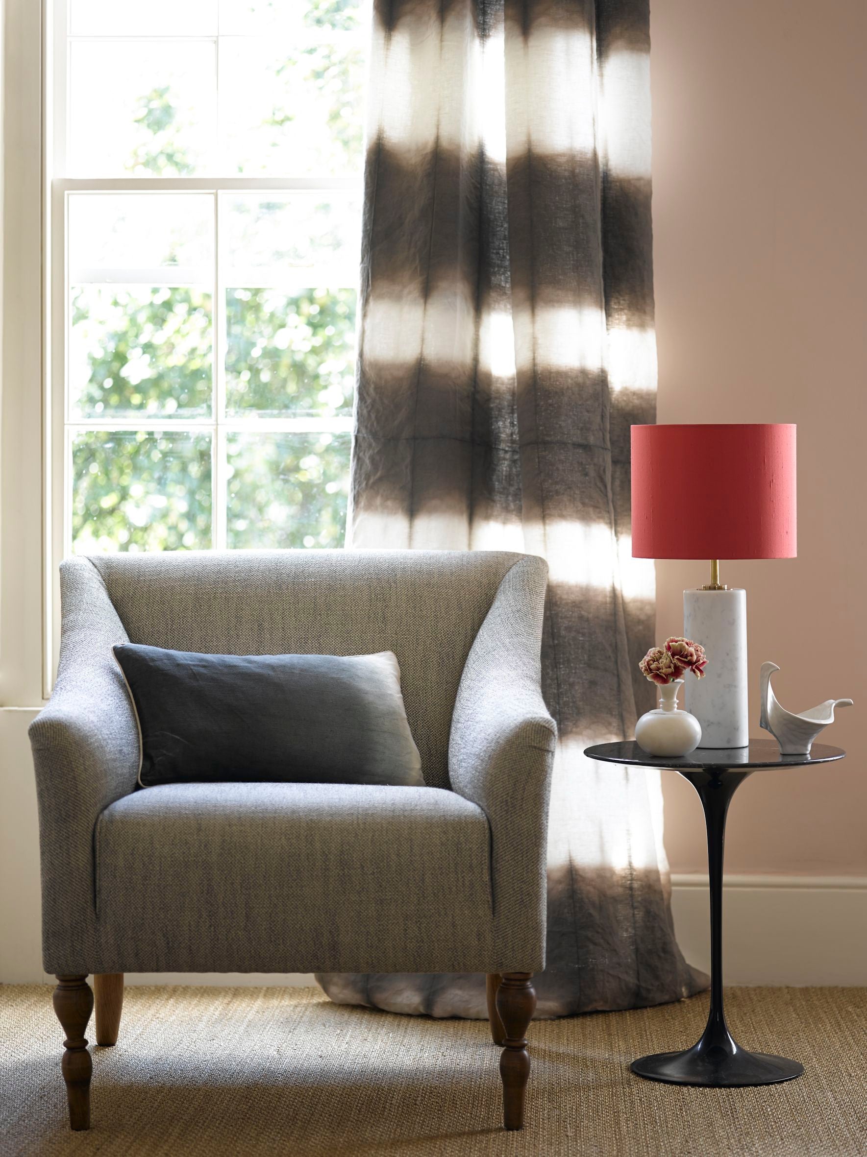
Our raspberry silk lampshade on a Herbert marble table lamp adds a pop of accent colour to a neutral scheme
Now, sneaking an accent colour into a room is great fun, but can often be a bit of a challenge – which is where table lamps can be your friend. With a bit of clever thinking, a well-chosen table lamp and shade can fulfil a double function in your scheme: it can provide one of your three kinds of light (ambient, accent or - if you use it to read by - task lighting), and it can also be a practical way to introduce an accent colour. But which colour? Here are some of the different ways you can approach accent colour and the 60-30-10 rule…
Choosing a colour scheme
 The colour wheel . Image credit.
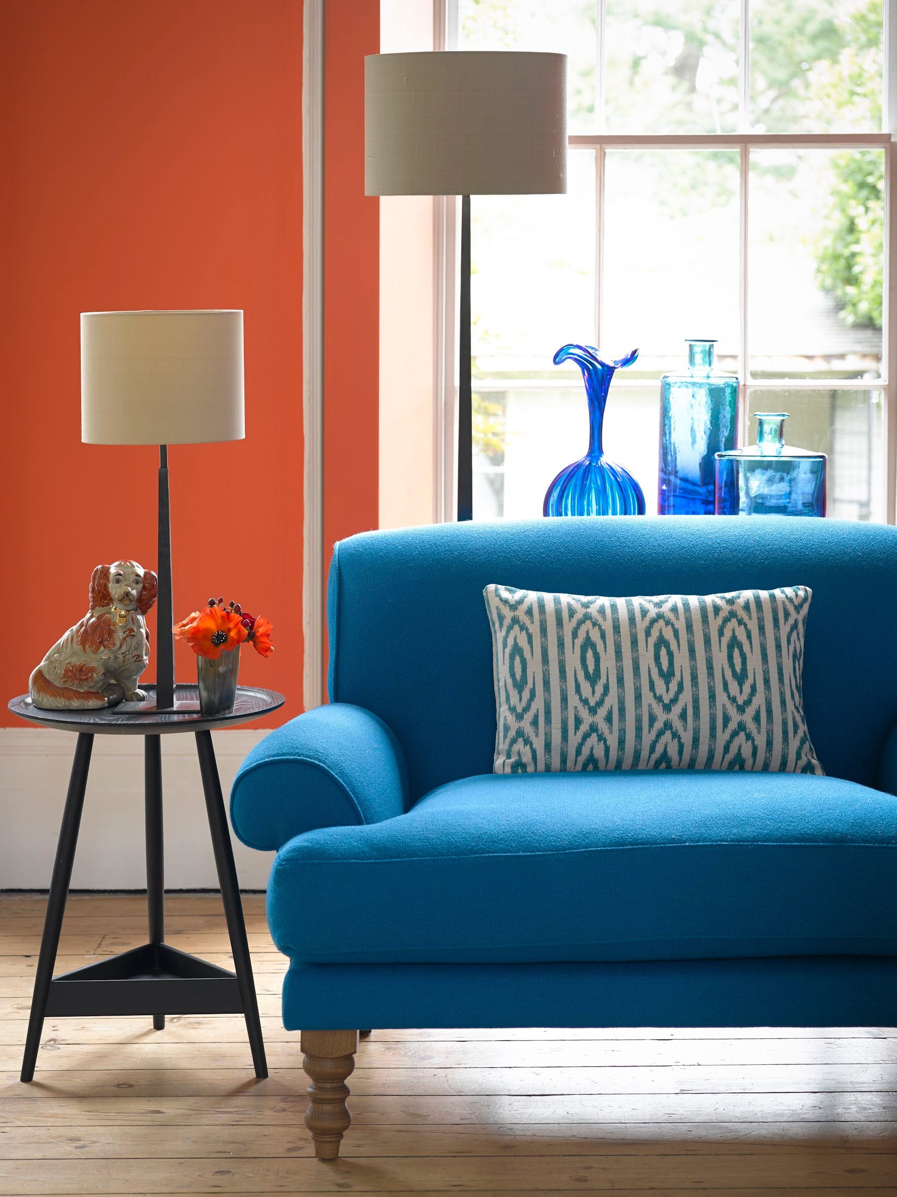
Complementary colours – this is a common way to use colour in a rule of three. Use a neutral as the main colour, and for the second and accent colour choose two that sit opposite each other on the colour wheel: for example, blue and orange, green and red, or purple and yellow.
Neutral shades – even in a neutral scheme you can make use of the 60-30-10 rule. Known as a ‘monochromatic’ scheme, you can use three shades of the same neutral (e.g. a white or grey) to create a calm, relaxing ambience. Choose your favourite neutral for the main colour, then use a darker shade of the same colour for 30% of the room to give it depth, and then a lighter shade for the accent colour, bringing warmth and brightness. There’s a great article about choosing the right neutrals on The Chromologist here.

Neutral shades for a soothing bedroom - using Farrow & Ball's Pavilion Blue No.252
Analogous colours – in this kind of colour scheme you select three colours that appear next to each other on the colour wheel – for example, yellow, orange and red; or red, purple and blue. This can create a very bold overall look. (Or if you’re very brave, you can use triadic colours – three colours with equal space between them on the wheel – most obviously, the primary colours red, yellow and blue.)

Analogous colour scheme using yellows, oranges and reds. Image credit.
Deliberate clashes – we all know the horrors of clothing colour clashes, but in interior design a little bit of clashing can be fabulous. It’s just a question of going with your instinct.

Farrow & Ball painted Pooky lamps.
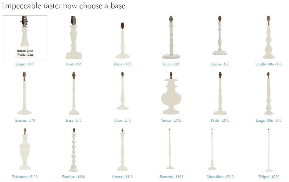
Choosing a Farrow & Ball painted table lamp
Of course, one thing about all interior design rules is that they’re there to be broken, so you can pretty much go nuts as long as you trust your taste. And with a combo of Pooky lamps and Farrow & Ball – well, you can’t really go wrong, can you?
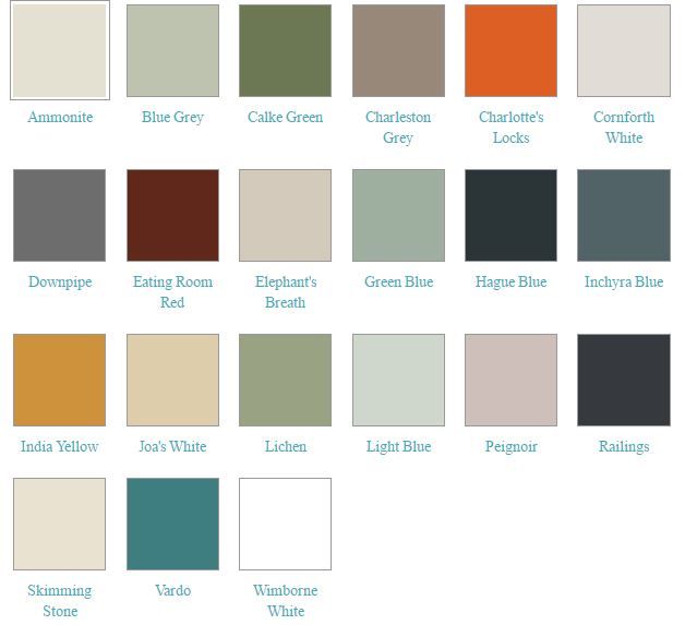
Farrow & Ball have helped us to pick out 21 of the most popular Farrow colours, giving you a huge range to choose from, including neutrals and bolder ones. You can combine these with your favourite Pooky wooden table lamp shape.
So whatever your approach, you can create the table lamp with the right accent colour for your room.
Have a play with it and find your perfect Farrow & Ball painted table lamp here.